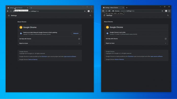
One of those is a way to improve dark mode in the browsers. Though the theme generally does a good job, a Microsoft engineer spotted that in Windows, hovering over a text for tooltip results in a white box, no matter the system theme. The company also realized that increasing the text scaling in the OS’ ease of access settings doesn’t increase the size. Both of these can be fixed by enabling Window’s Aura tooltip by default. Google has already implemented this in Chrome Canary, with some tooltips now showing a rounded grey box and others dark black with white text. As well as this, Microsoft’s improvements to the ‘Find’ box have debuted in Canary.
Improved Find Box and Forced Colors
Under the new Find system, users can select text that’s already on the page and hit Ctrl + F to search for more instances. This should make it much faster to search for repetitions, and Microsoft is also adding the ability to press ‘Esc’ to exit the find menu quickly. Finally, it’s spearheading a ‘forced colors mode’ for the browser that would apply the user’s OS theme to web content. For example, users who have high-contrast mode enabled will notice that webpages with compatible content will match their preferences. These are just some of many changes Microsoft has been pushing in Chromium. It highlights how ceding to Google cuts down on diversity and competition, but can still push the web forward in various ways.


